Portfolio Website
A case-study driven portfolio built to communicate proof, focus, and availability faster.
Turned a broad, portfolio-template feel into a site with clearer positioning, real project proof, and lower-friction contact paths.
role
Designer & Full-Stack Web Developer
team size
Solo build
updated
2026-04-07
overview
What the project is and why it mattered.
This project started as a clean portfolio foundation, but it needed stronger positioning and better proof. The rebuild focused on case studies, richer metadata, more intentional route structure, and clearer recruiter/client messaging.
01
Audience
Recruiters, clients, collaborators
02
Focus
Proof-first project storytelling
03
Shipping
Live on jeremymhayes.com
problem
The original site had good visuals and working infrastructure, but it still felt broad. Placeholder content, overlapping routes, and generic calls-to-action made it harder for visitors to quickly understand what kind of work I do best.
role
I designed and built the site end to end, from the App Router structure and content model to the UI system, project archive, protected contact flow, and metadata setup.
build details
Stack, constraints, and decisions.
Stack
Constraints
- The site needed to stay fast and maintainable while becoming more content-rich.
- Project data had to work across cards, archive views, metadata, and detail pages.
- The contact experience needed to remain simple while still filtering out spam.
Decisions Made
01
Move from placeholder cards to real case studies
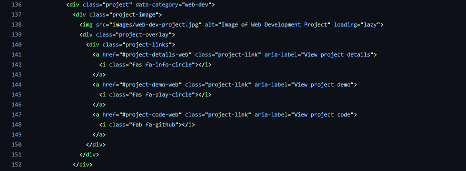
I introduced a richer project model so the homepage, archive, sitemap, and detail pages all draw from the same structured content.
02
Simplify the route story
Instead of splitting attention between overlapping archive routes, the navigation now points visitors toward a single projects hub and individual case studies.
03
Replace decorative CTAs with intent-driven ones
The homepage now emphasizes current focus, availability, and a direct invitation to start a conversation rather than a placeholder newsletter flow.
outcome
What came out of it.
Outcome
- Added individual project pages with consistent case-study sections.
- Improved homepage positioning around secure software, modern web apps, and gameplay systems.
- Kept contact protection in place with a Turnstile-backed submission flow.
Lessons
- A portfolio feels stronger when it proves thinking, not just polish.
- Information architecture matters as much as visuals once a site has real depth.
- Structured content makes metadata, navigation, and future maintenance much easier.
Next
- Add stronger social proof and a more intentional contact intake flow.
- Expand the notes/build-log portion of the site.
- Continue adding richer visuals and dedicated Open Graph images for top case studies.
keep browsing
Keep moving through the archive or reach out if you want to talk through similar work.